Music UI Explorations
I’m a daily user of Apple Music but I felt the Mac app adopted some unintuitive UI conventions with the macOS Tahoe “liquid glass” design updates. For fun, I decided to redesign some of the UI to better spotlight the core controls while making the overall user experience more unified and immersive.
Please note—this is a personal project and I don’t work for Apple. I’m a big fan of the app in general, so my designs are shared with respect for the craft 😊.
My immersive, unified Music design:
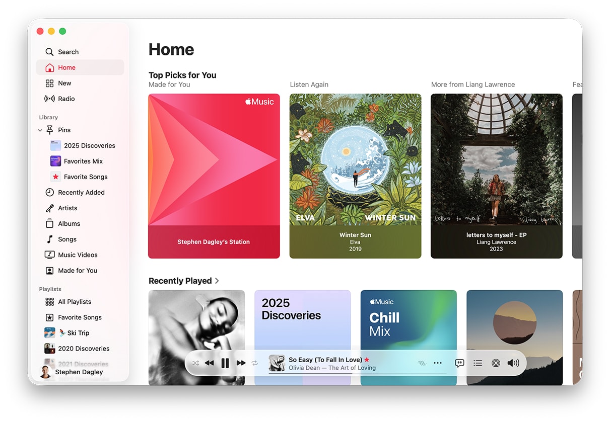
The existing Music app
My frustrations with the current design
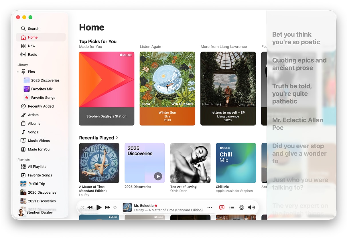
The macOS app takes on the veneer of the “liquid glass” design style, but because it maintains pre-existing design elements, such as the fixed left-nav pane, the effect is muddled. This left pane is given some translucency but the effect is wasted since no content ever moves behind it.
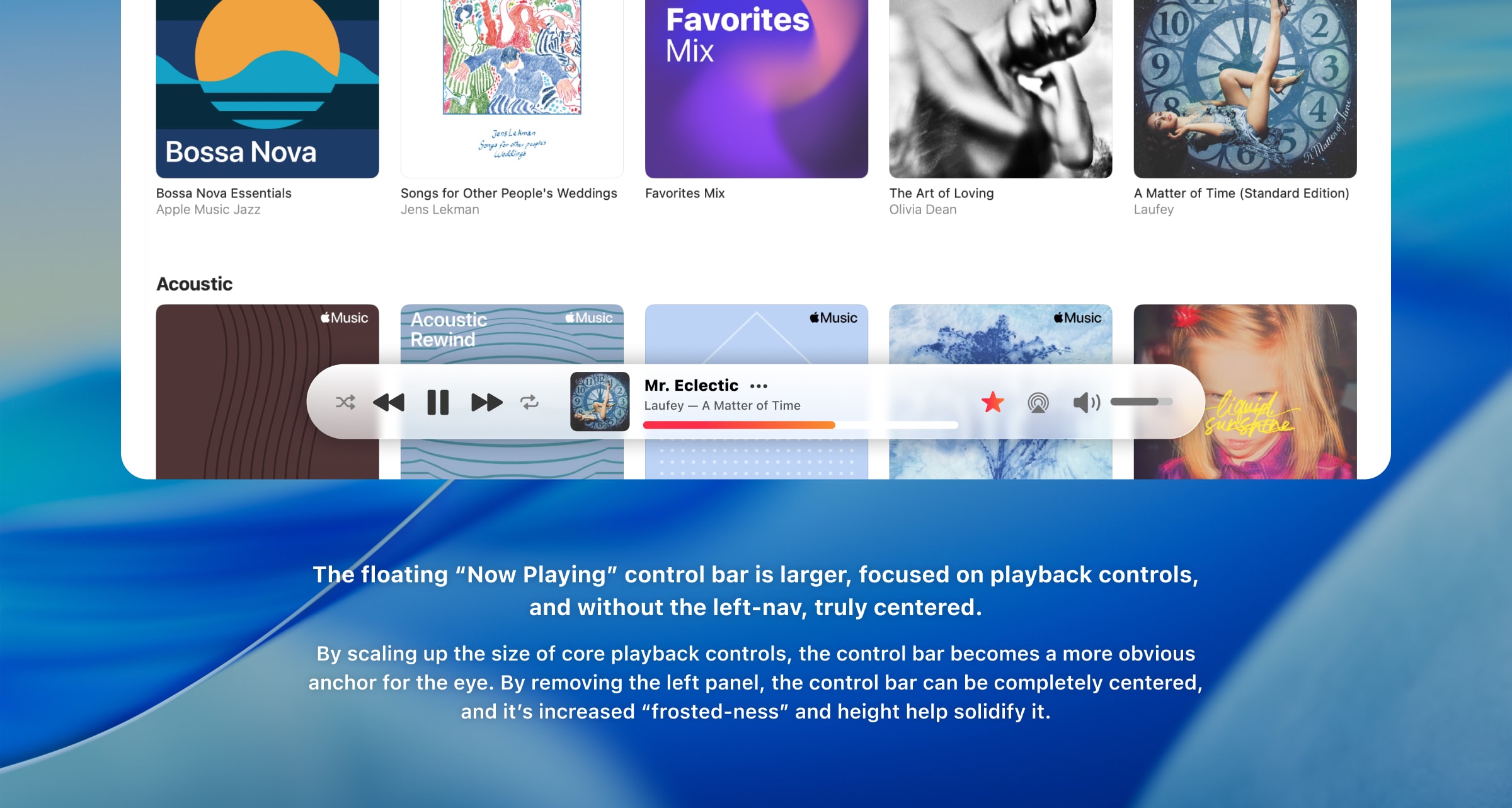
The “now playing” controls have moved from a fixed top pane to a floating “control bar” at the bottom of the app. I don’t mind the location, but it’s modest size and translucency allow it to sink back in the design, which is unfortunate since it houses the core app controls and most important information (the currently playing song).
The toggles for song lyrics and the queue also reside in this control bar, but activating them opens a disconnected panel on the right side of the app, with no animation. I find myself searching for a ‘close’ button in the newly opened panel before realizing the button is back in the control bar.
Overall, the mix of left-pane and floating controls take away from the immersive intention of “liquid glass” and toggles disconnected from their content cause disorientation.
Apple Music Reimagined
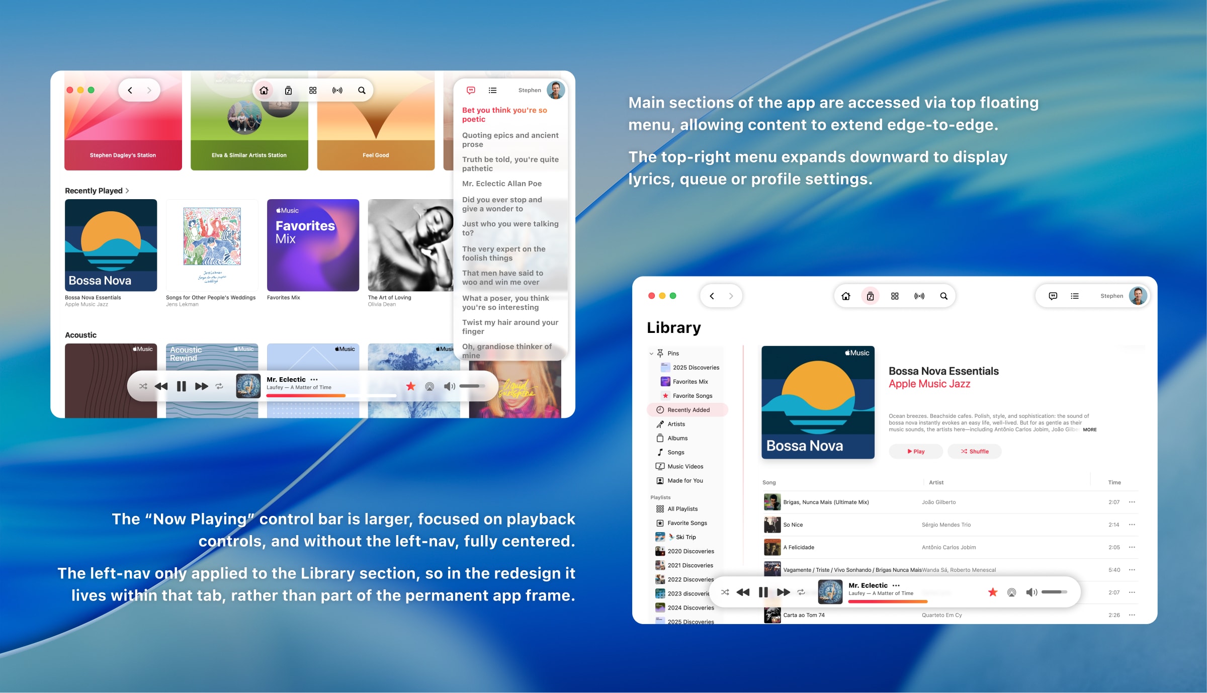
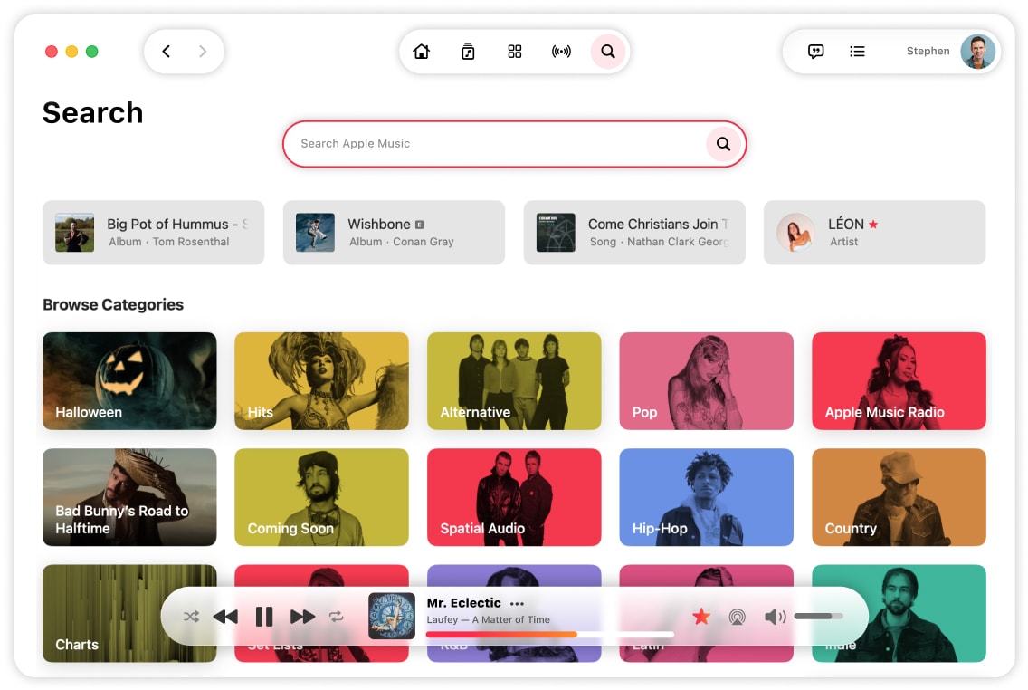
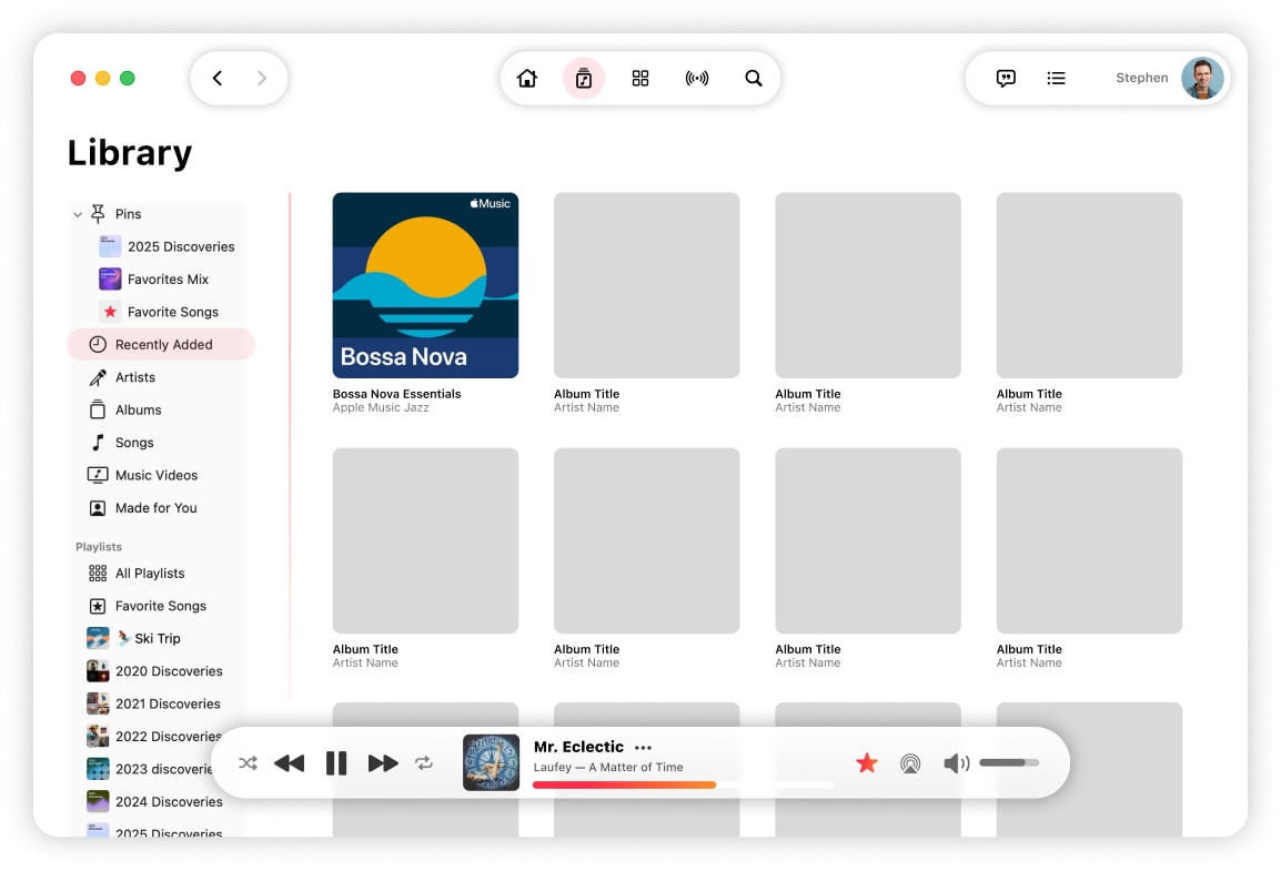
The Liquid Glass aesthetic works best when the glassy UI elements float above immersive edge-to-edge content. The mix of anchored panels and floating bars diminished this effect, so I chose to embrace a fully unified UI where the primary app navigation floats permanently across the top of the window allowing content to fill the full app frame—the horizontally tabbed sections more closely mirror Music’s iOS counterpart.
I also wanted the “Now Playing” control bar to command more attention and stand out over the app content. The tweaked design uses a frostier glass effect and is larger to allow the play controls and current song to stand out. Lastly, the ‘seek bar’ is much bolder, pulling in Apple Music’s red brand color. I believe it should be fun to watch the song play!
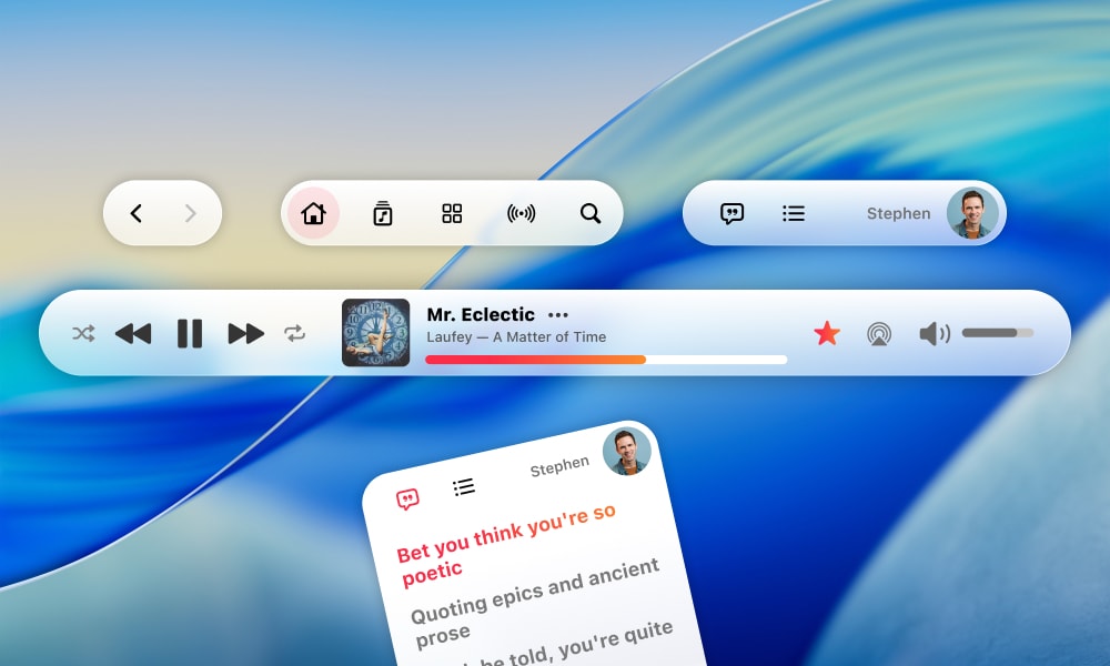
Finally, I addressed the disconnected user experience of the lyrics and queue panels by pulling their toggles out of the Now Playing bar and into their own section of the top nav that expands downwards when toggled—ensuring the toggle is physically connected to the content it opens while bringing back the opportunity to smoothly animate the interaction.
This streamlined navigation design makes switching between the major app sections more obvious, allows screen content to take center stage, and appropriately anchors the “now playing” controls.