Gordon Website Relaunch
In 2025 I led a project to redesign Gordon College’s website from the ground up on a new platform. The year-long process involved drafting an RFP, researching and selecting a CMS and partnering with a web development agency to design and build a modern site tailored to the college’s needs.
The Challenge
The previous site was self-hosted and managed through a dated CMS that was built in-house on a deprecated programming language. Our team spent a lot of time manually building designs and features with HTML and CSS to work around the limitations of the CMS. All this "hacking" made it difficult to keep up with SEO and accessibility standards and led to a site that became more inconsistent as it grew (the accumulation of outdated content was another problem).
The goal
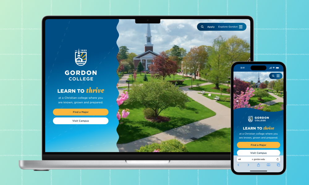
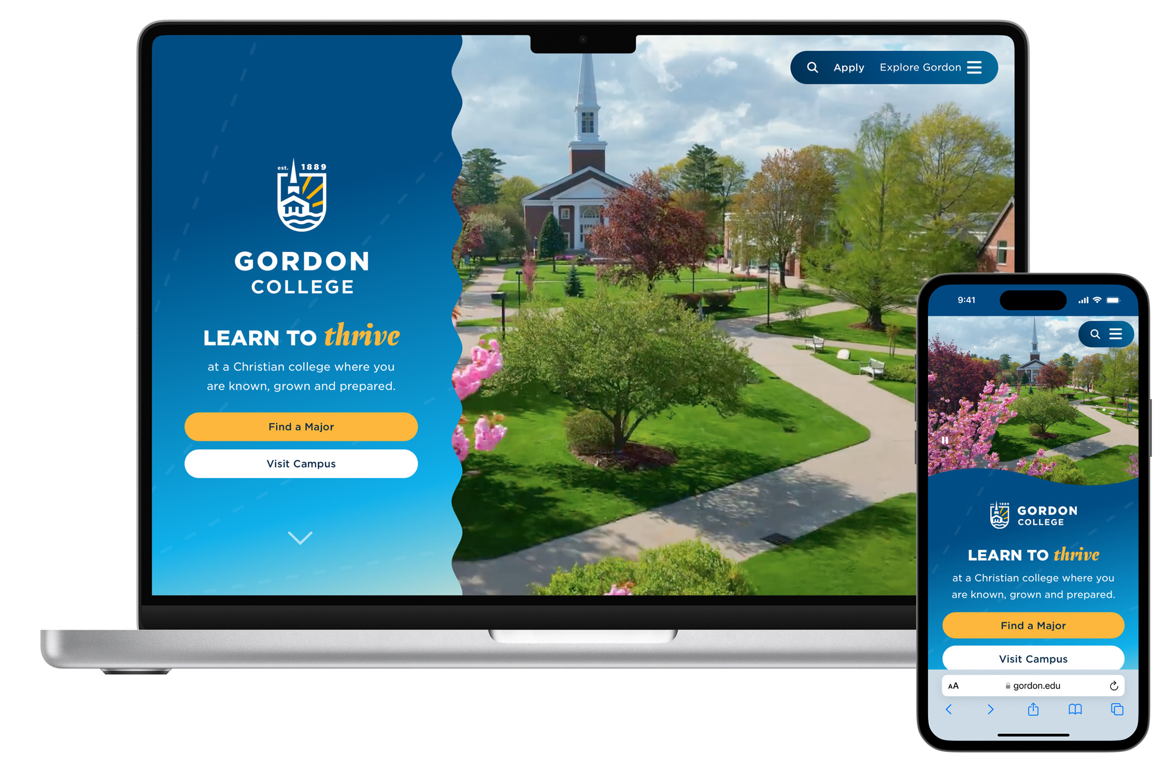
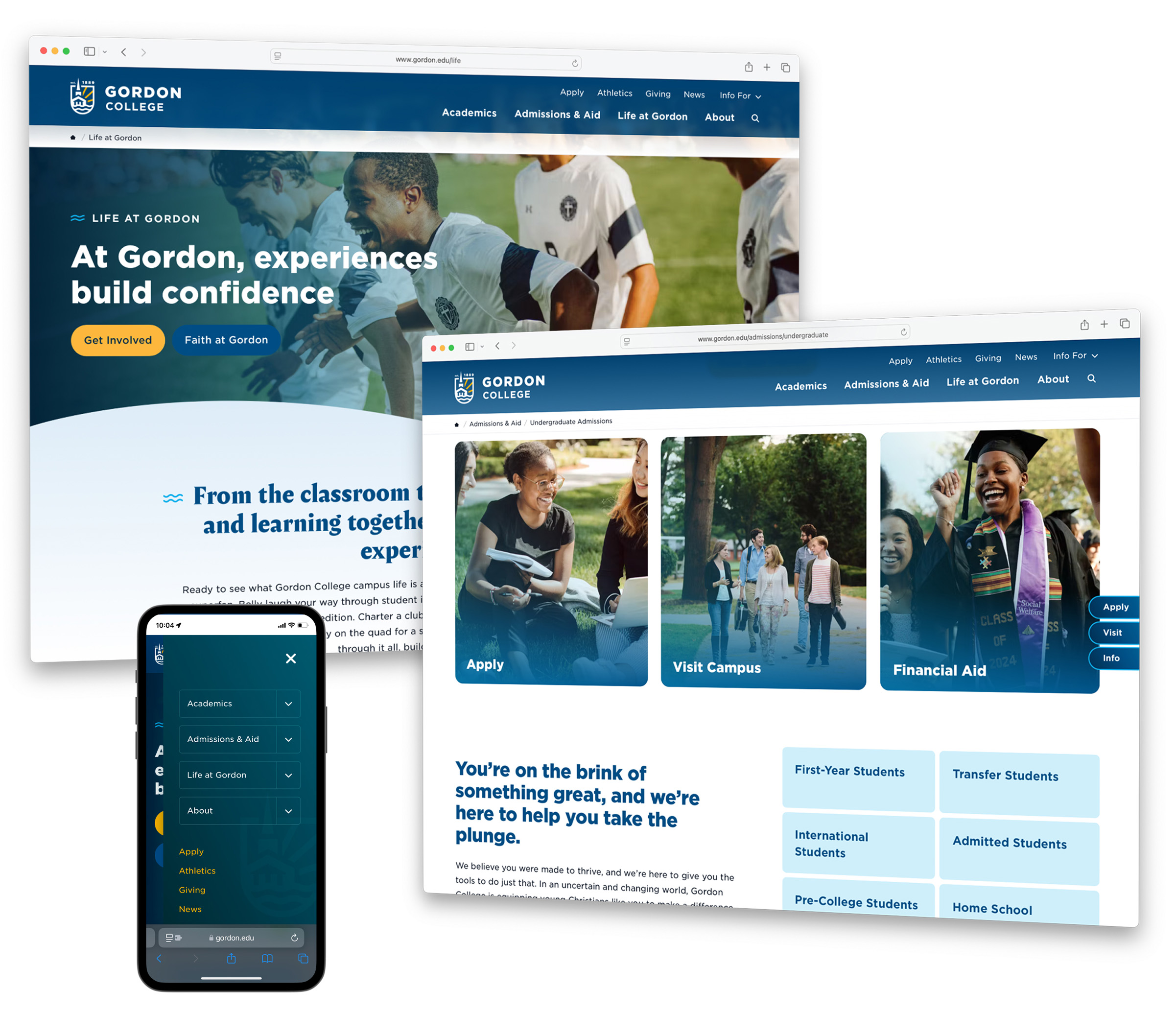
Our goal was to launch a faster, more reliable website optimized for SEO, social sharing and accessibility, and that allowed our marketing team to publish with greater speed and agility. To do this we landed on a platform called Craft CMS and partnered with Mostly Serious, a creative web agency specializing in the tool. Together, we designed and built a website that is both beautifully expressive and more intuitively structured, guiding visitors more effectively towards key actions and improving navigability.
The outcome
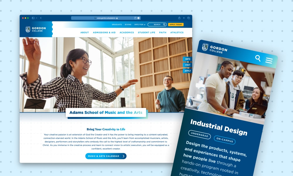
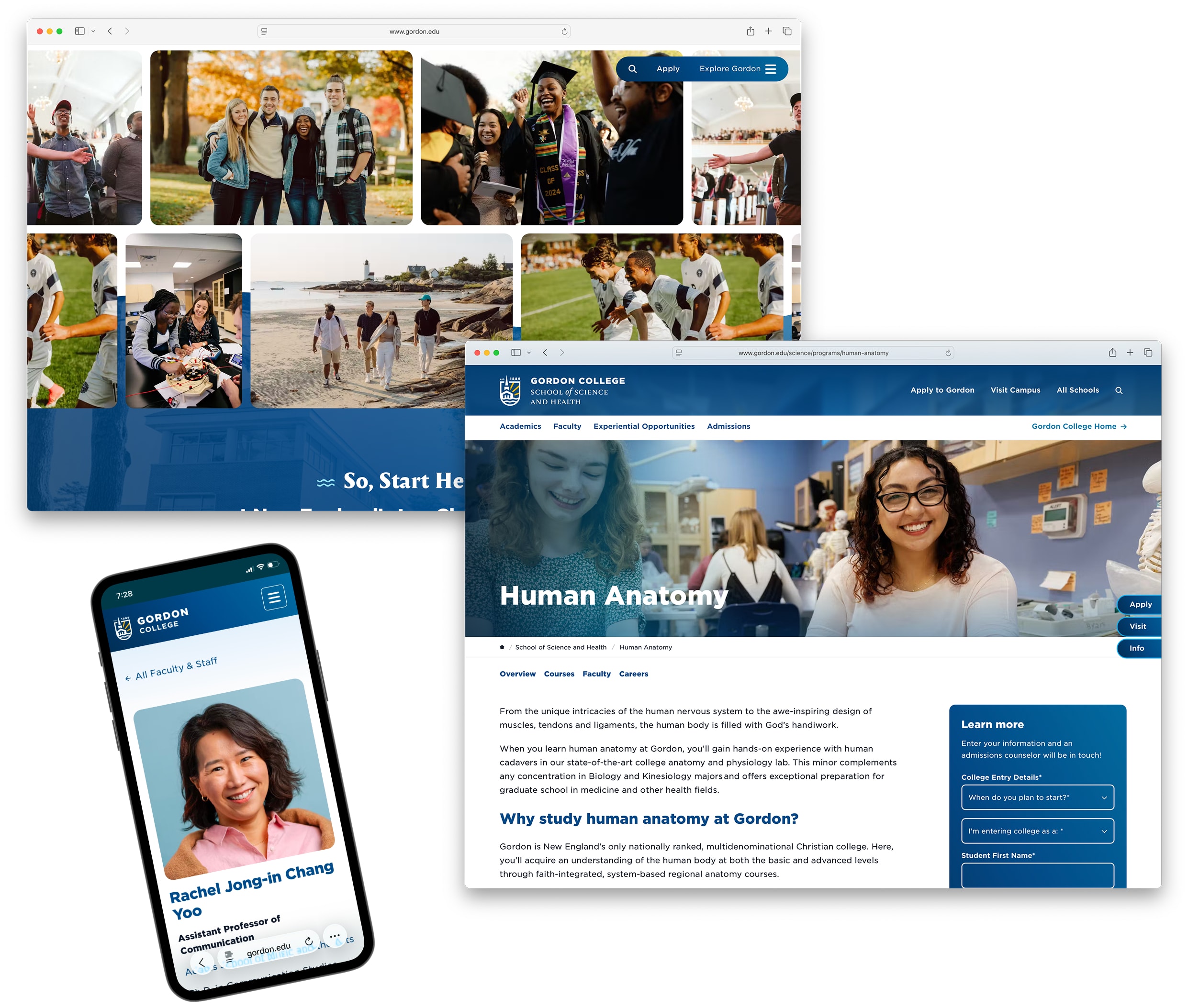
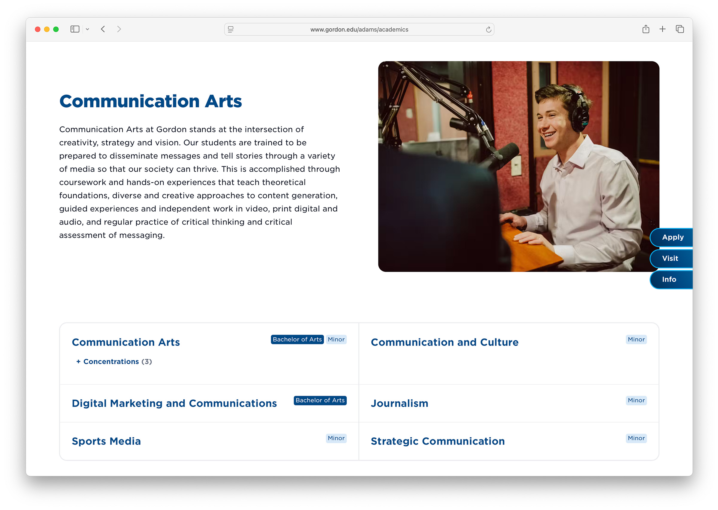
Key features of the new site include searchable and filterable academic programs (a top use-case for prospective students), an integrated blog, sub-sites for each school within the college, and a reimagined and consistent design and user interface that better expresses Gordon's brand while providing a much more structured and rich navigation.
Under the hood, our custom Craft implementation provides a powerful modular editing system that allows our team to assemble engaging layouts while adhering to a cohesive design system that is WCAG AA compliant.
A modular approach
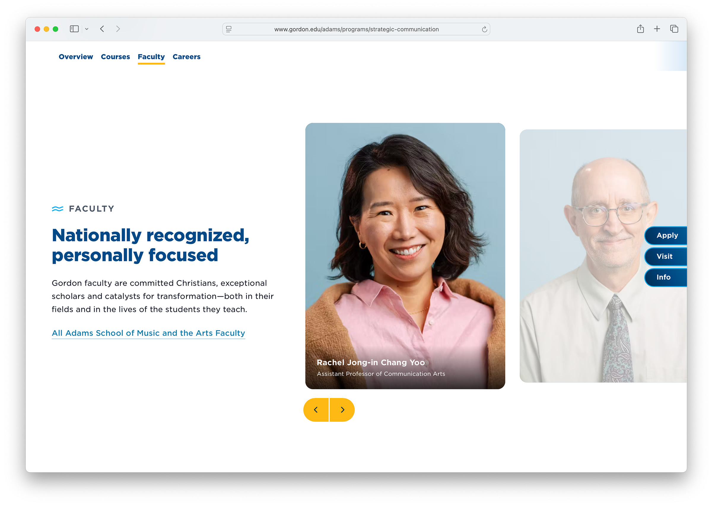
Rather than build the site around a set of baked-in page layouts, we built a library of reusable and customizable “modules” that serve as building blocks for pages and entries. This design system empowers us to assemble visually engaging layouts that serve a wide range of needs while adhering to a cohesive browsing experience.
The searchable and filterable program directory was a major feature. We created custom fields for all the necessary attributes such as degree type, format and courses. Designing these entries around structured data allowed us to manage and organize the list of over 100 academic programs in a way we never could previously.
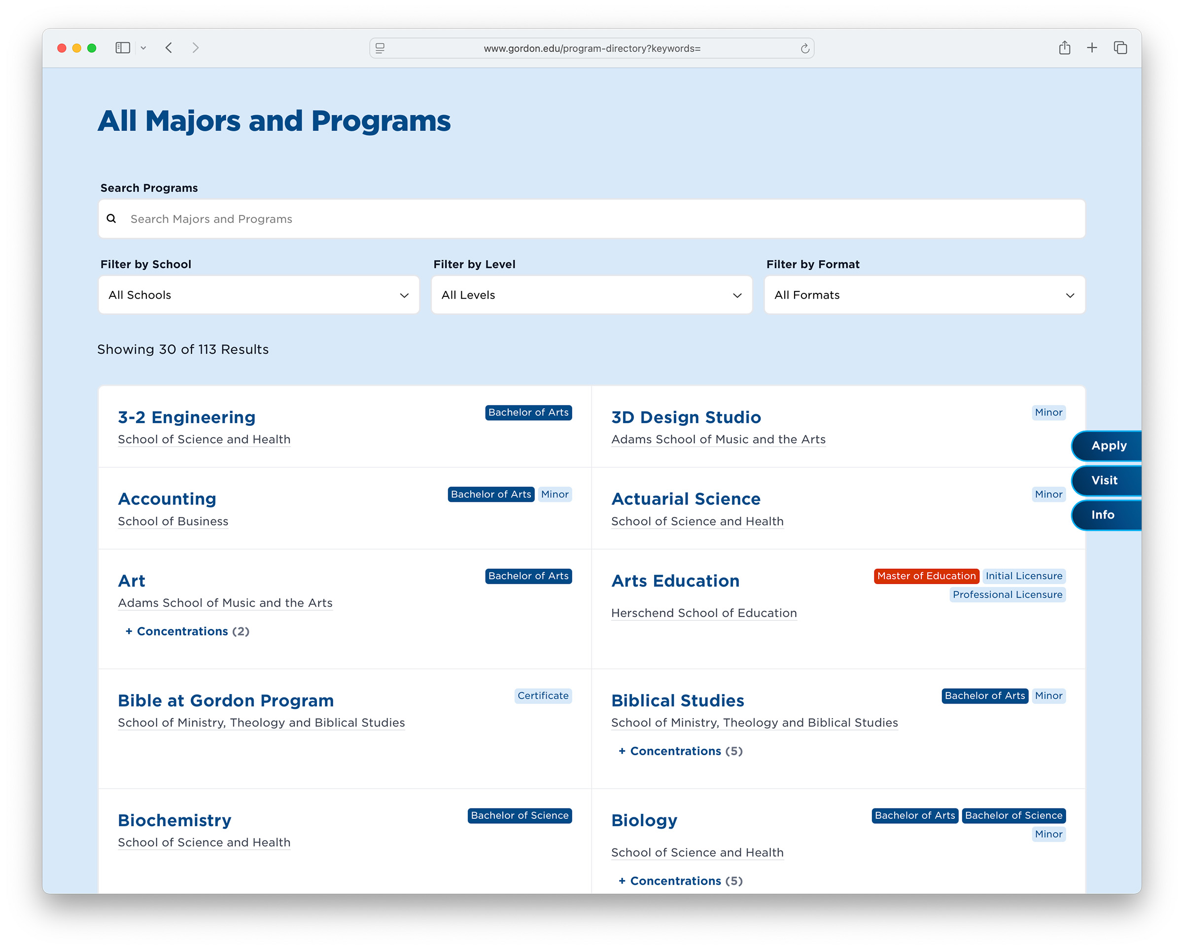
View the Academic Program search:
Explore a content pillar:
Bringing stakeholders along
One of the nuances of managing a college website is the wide number of stakeholders and contributors across campus. While the site is a marketing vehicle and managed by our marketing team, we rely on a number of individuals in various departments to keep it up to date. Many of whom, naturally, feel a sense of ownership for the pages they maintain!
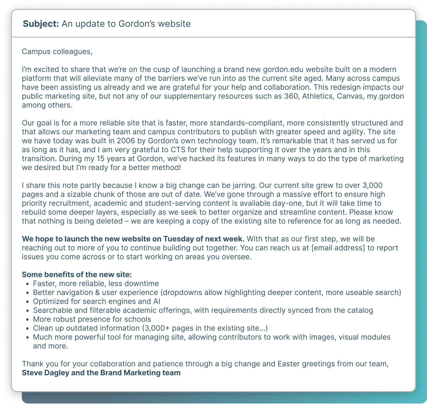
Throughout this re-platforming process, I updated various segments of campus with different levels of frequency and detail: faculty, deans and administrators; current web-contributors; and finally the campus at large. Below is our pre-launch alert to the whole community: