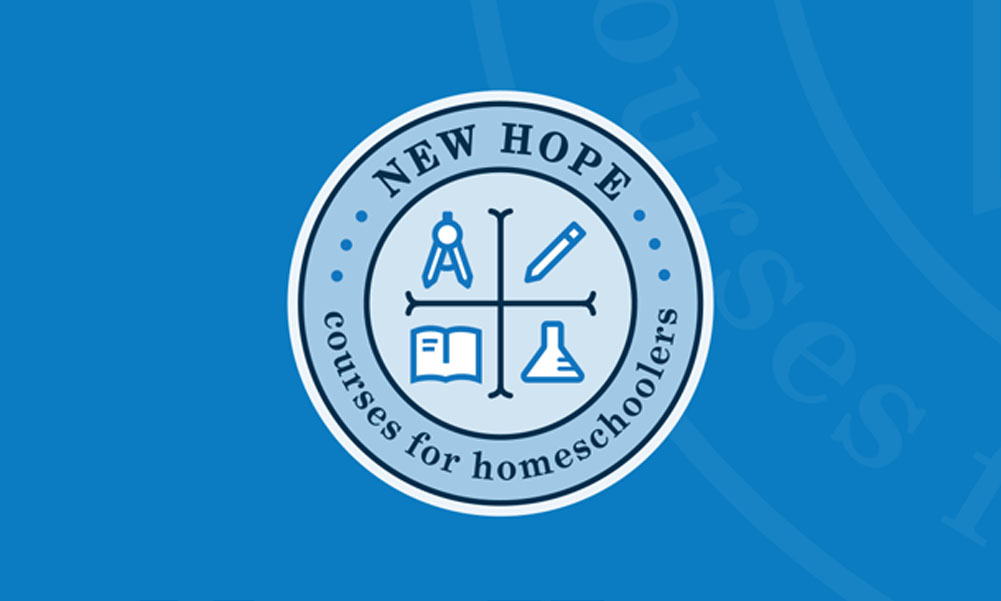
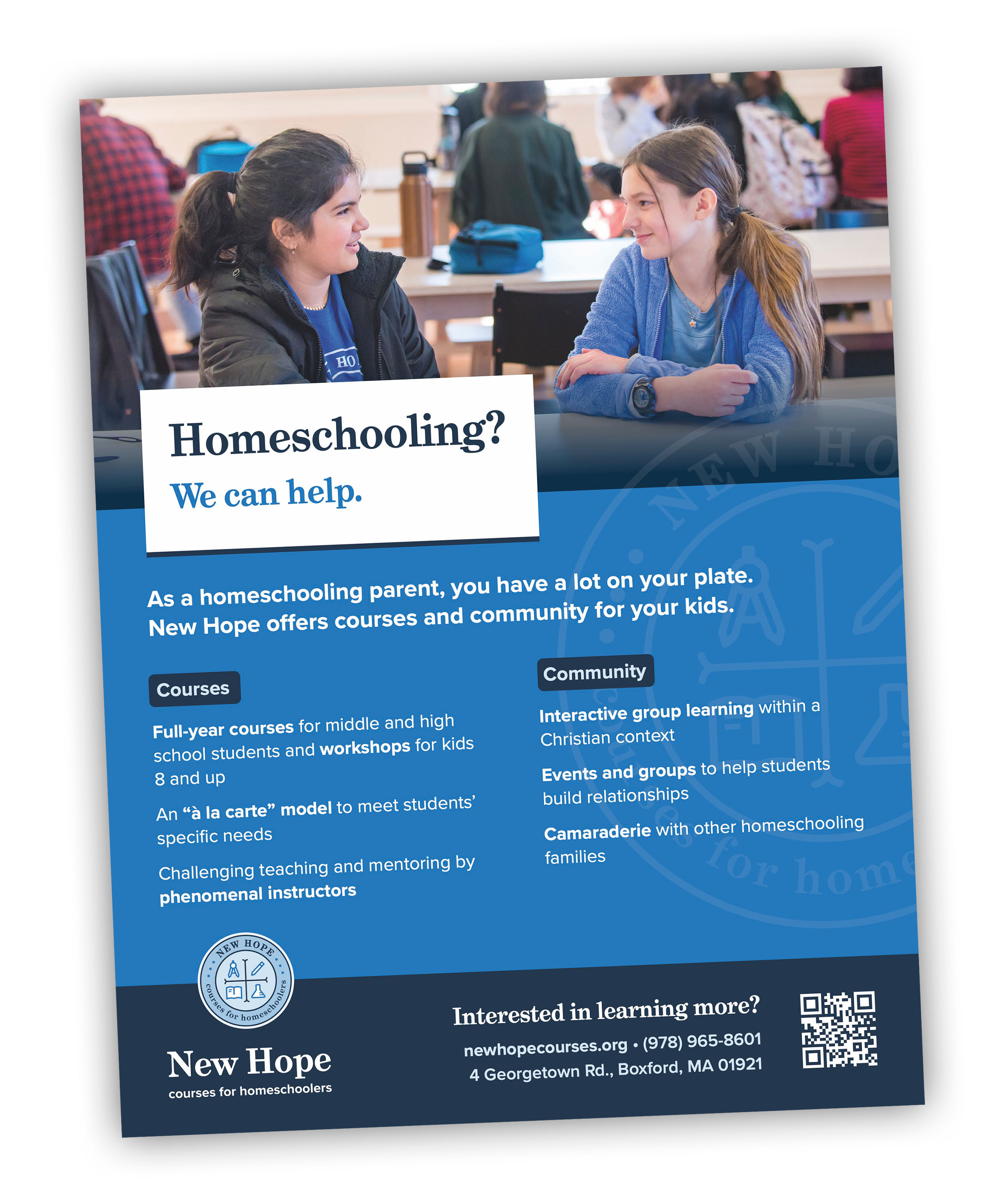
New Hope provides high-quality small-group education for homeschooling students, with access to resources such as labs to complement a traditional homeschool experience. For this brand refresh, they were looking to clarify their identity and what they offer, as well as modernize and their logo.
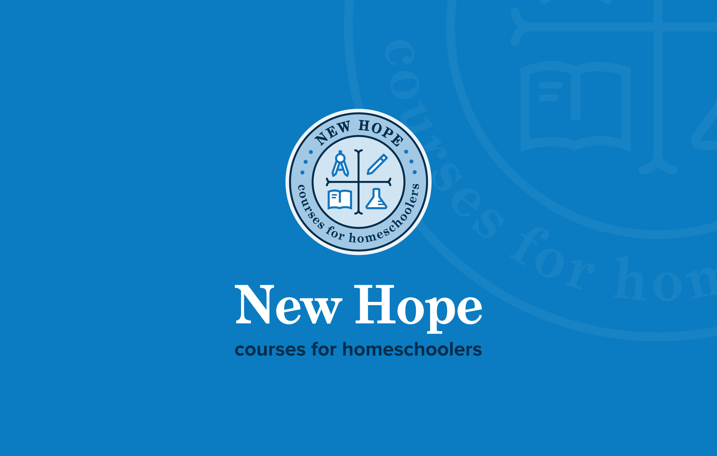
To help clarify New Hope's identity, we moved away from their previous name, "New Hope Tutorials," which was meant to evoke the British tutorial system but hadn't quite stuck. Instead, we paired the commonly understood portion of their name with a descriptive subtitle that very practically spells out what they offer: courses for homeschoolers.
For the logo itself, we wanted to communicate high academic quality and rigor without appearing elitist or stodgy. From New Hope's blog:
"Here we have a sense of the rigor of the academics we offer, our strong STEM and humanities courses, and a subtle “cross” design affirming our Christian character. We’re also pleased that the seal is humble, a tad more informal than a prep school might have, a hint that though we are rigorous with our academics we are at heart a family operation."


reports & guides
Collecting and recollecting my favorite adventures for your enjoyment. Explore trip reports and guides, photo essays and video dispatches from the corners of the earth I’ve managed to wander through.
EXPLORE JOURNAL