Gordon Brand Refresh
Guiding a polished and established brand towards a more personal and adventurous reflection of the school’s robust community, coastal New England location, and the hope and potential graduates bring into the world.
The biggest (and most stressful 😅) project I led as Creative Director at Gordon College has been a comprehensive brand refresh in 2023. After a decade working with Gordon’s brand, I felt in a unique position to expand on its strengths and open up new opportunities.
The Brief
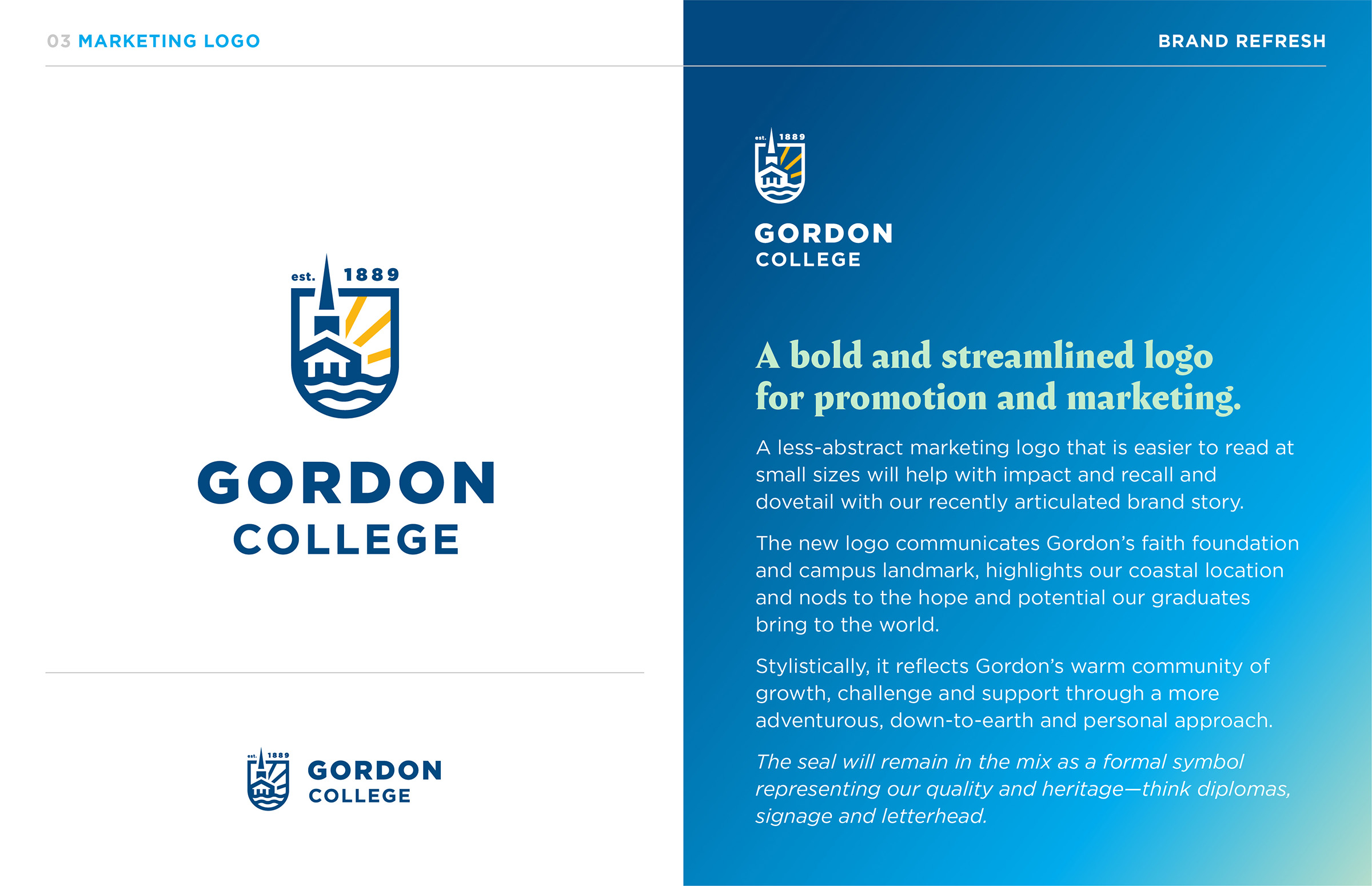
Gordon’s previous visual branding was centered around its institutional seal, which remains important. But due to its complexity, it wasn’t visually distinctive at a glance, and while it properly communicated Gordon’s heritage, it did not reflect the more personal and adventurous ethos that defines Gordon’s community as a small, intentionally-Christian liberal arts school with deep New England roots.
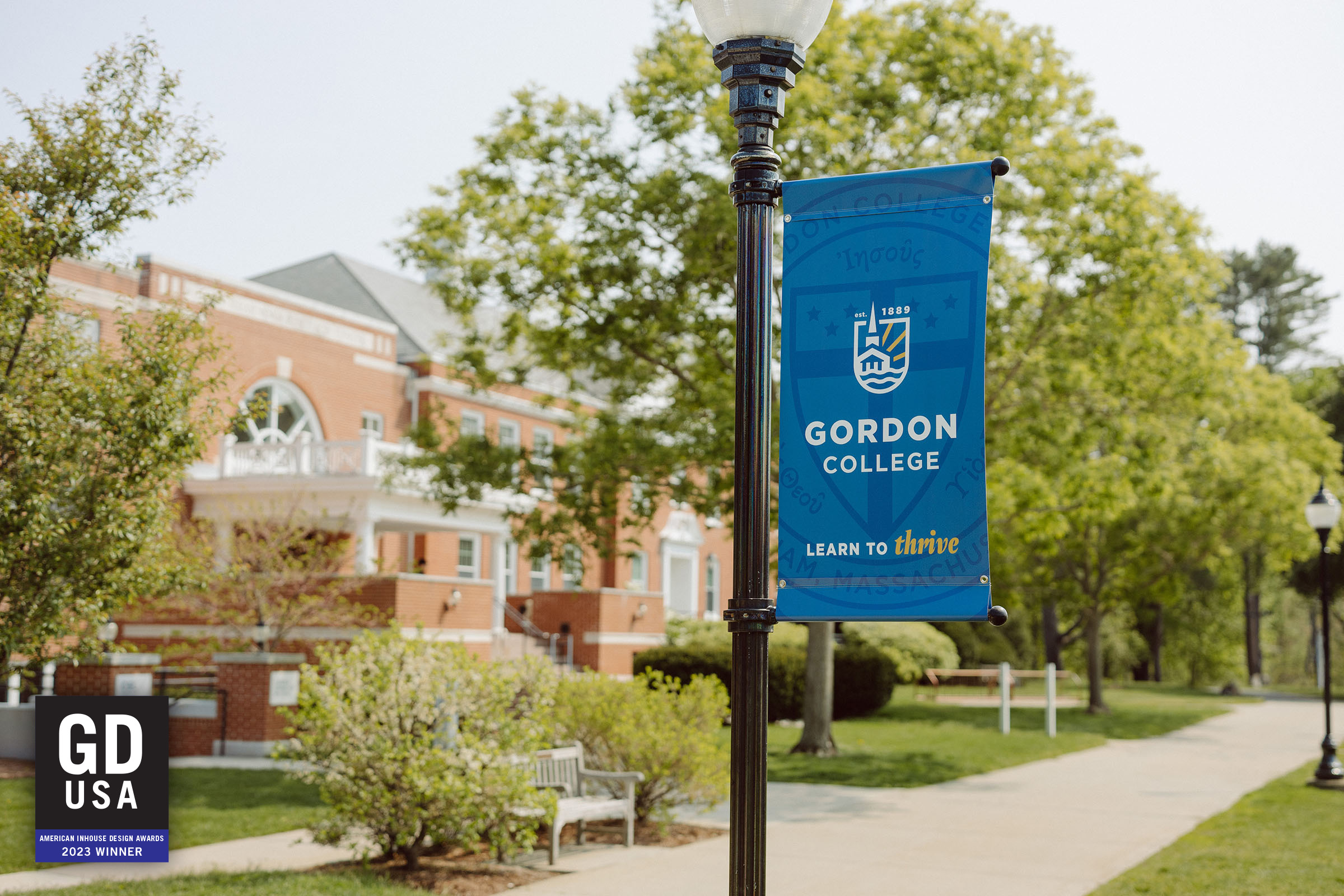
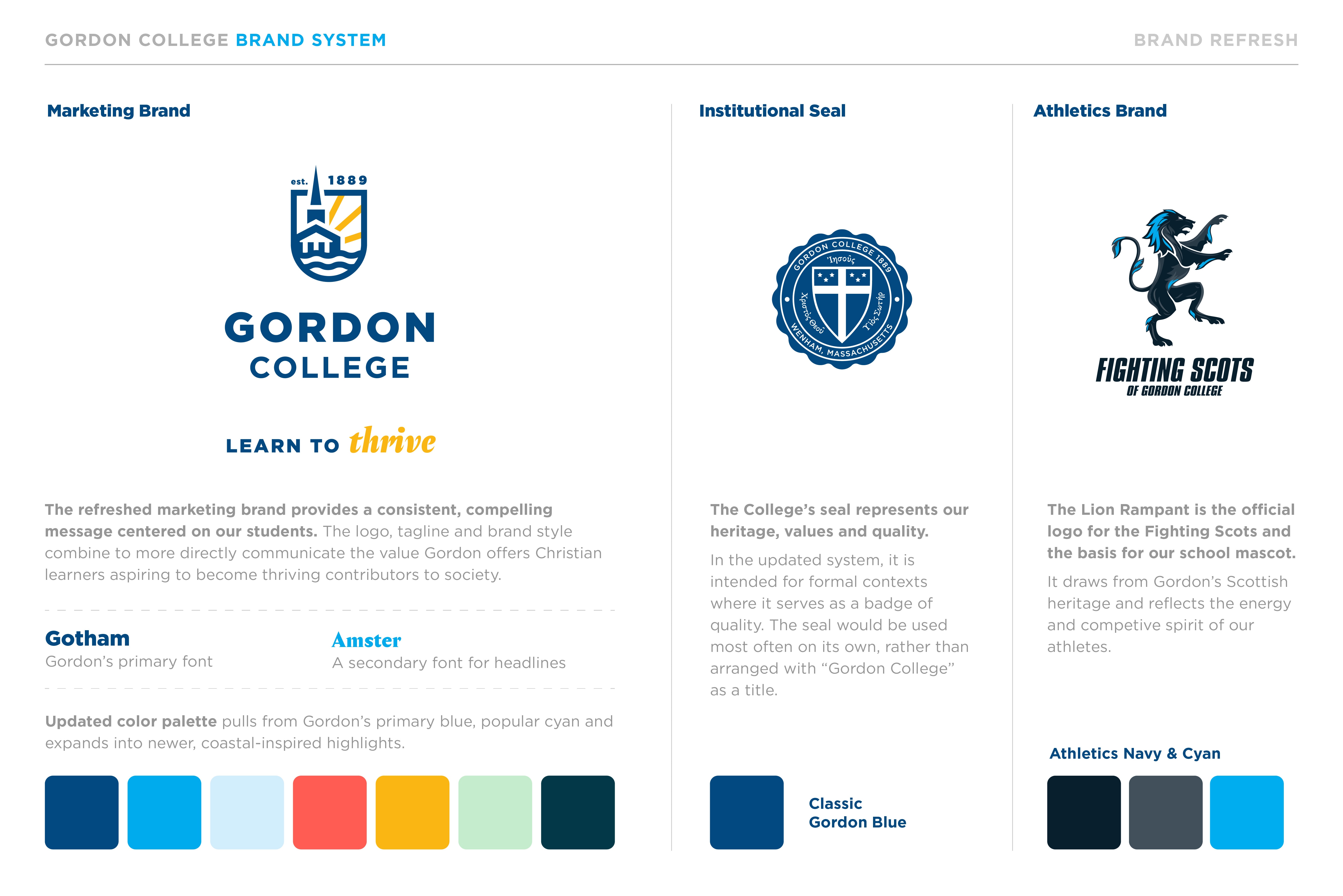
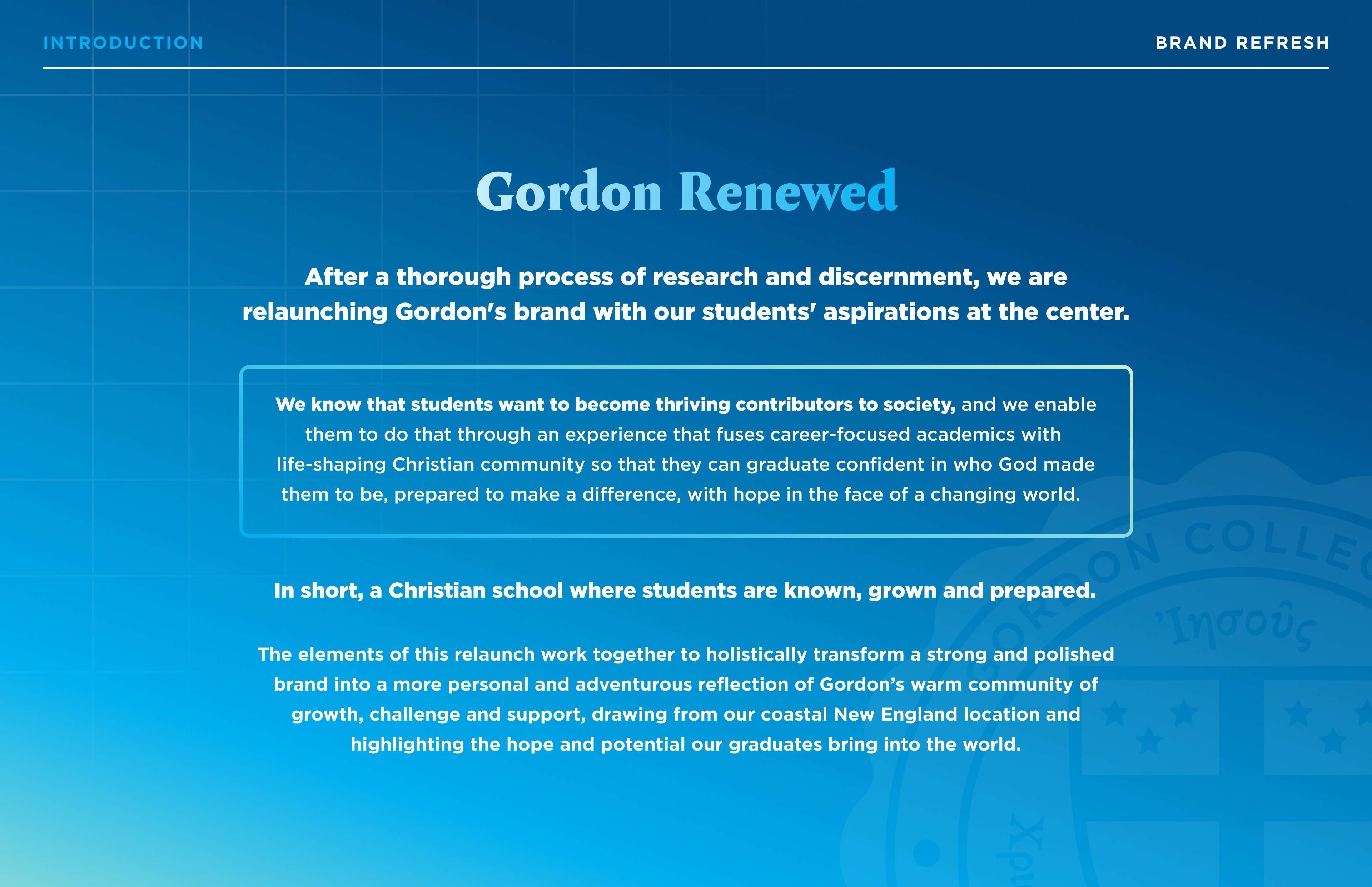
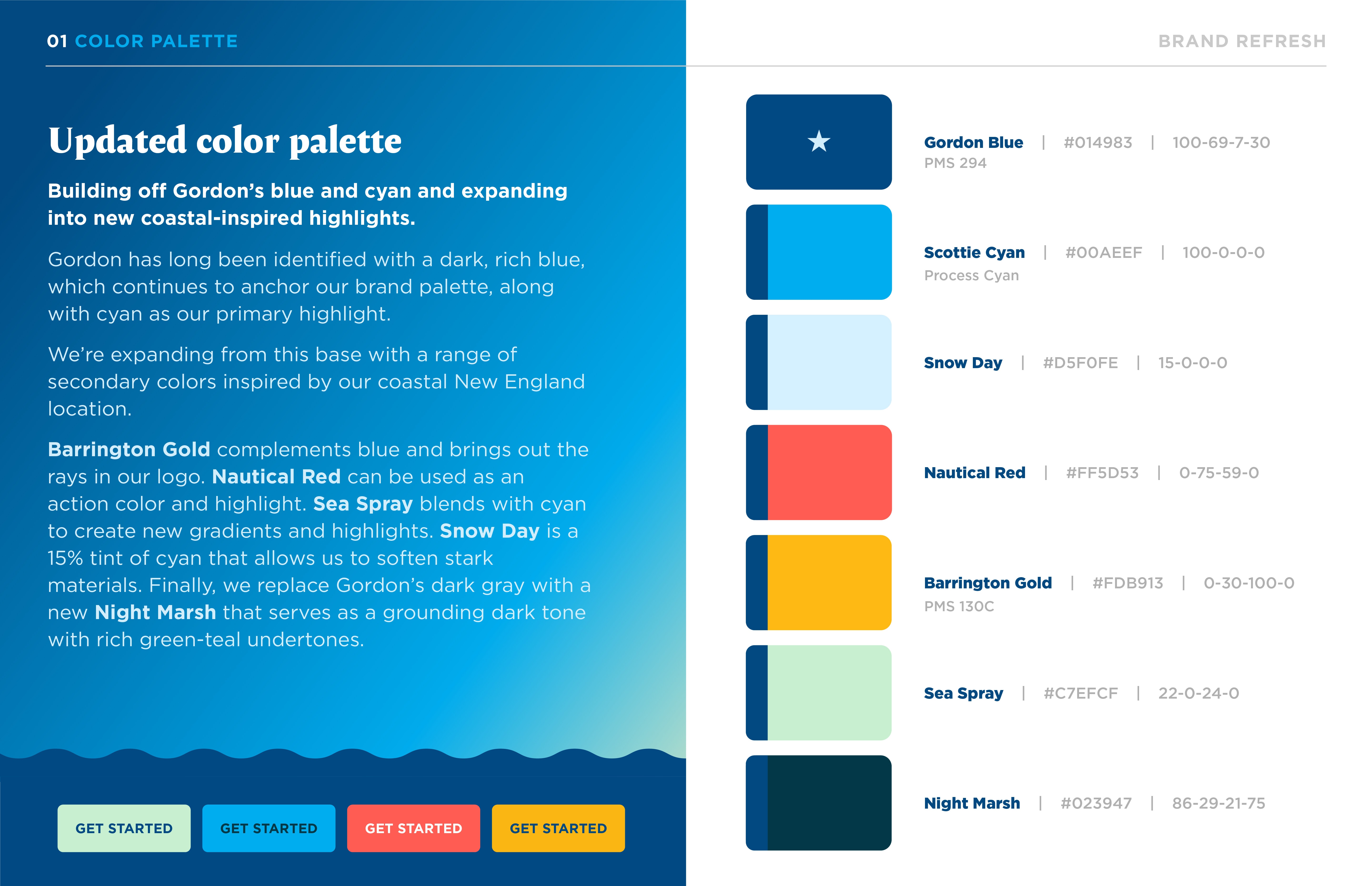
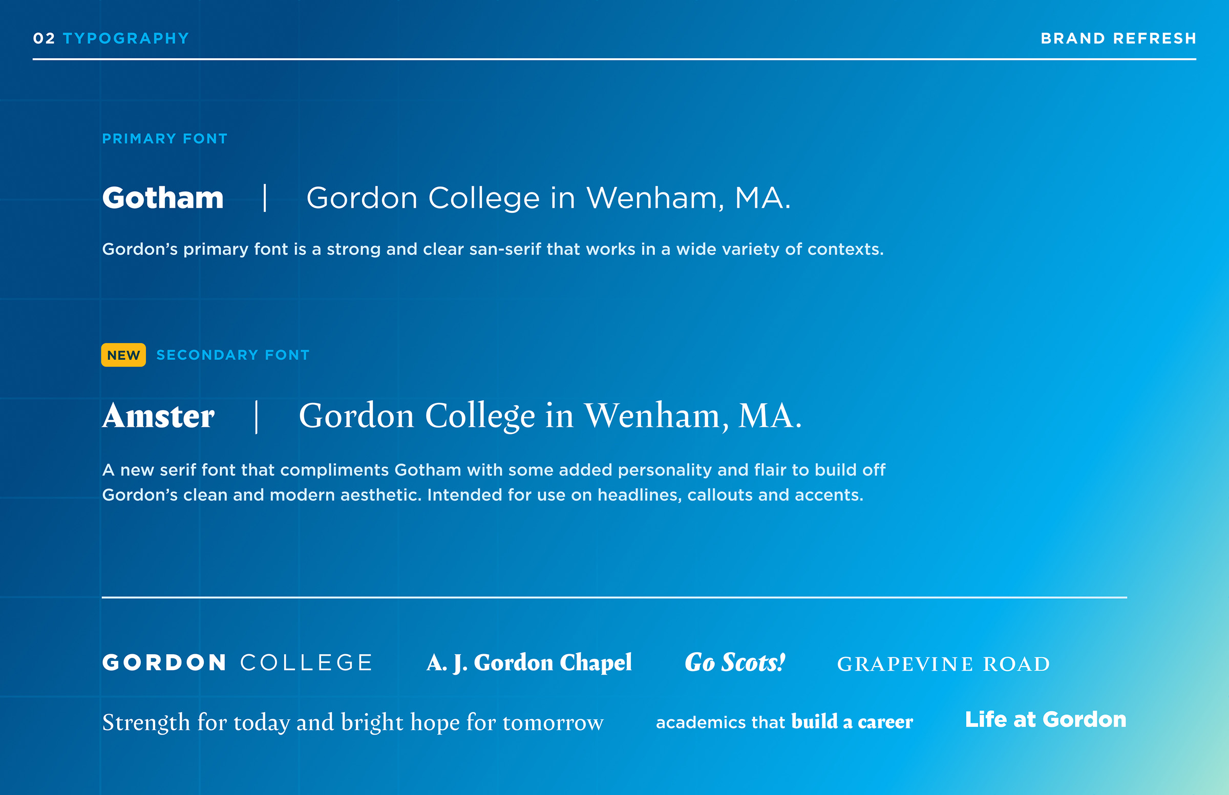
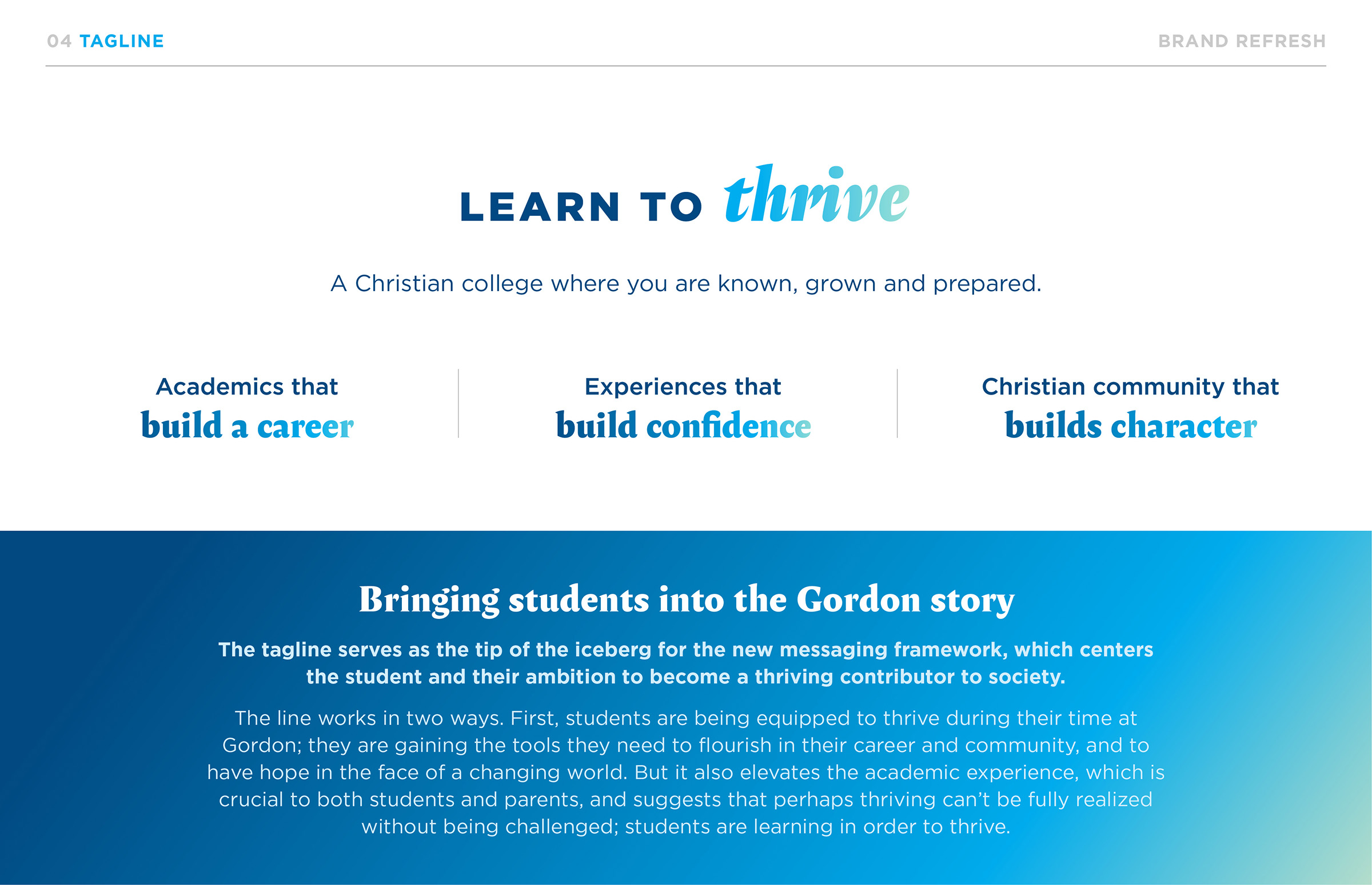
The rebrand included developing a marketing logo, tagline, updated color palette and a new headline font, all of which were undergirded by a renovated messaging and brand positioning framework.
The Process
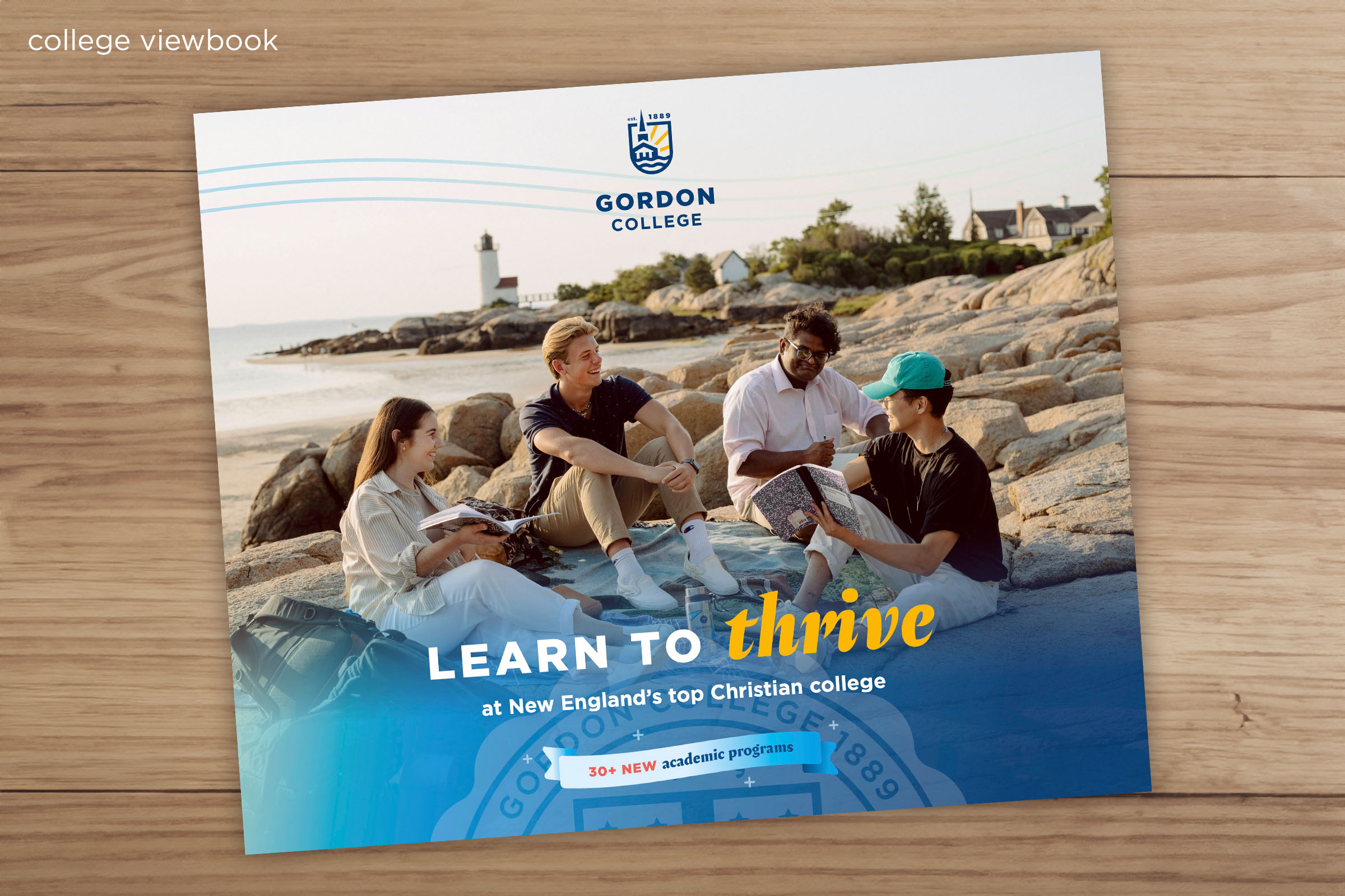
This redesign came at the crossroads of new college leadership and an industry in flux. Our creative team advocated for the brand redesign to be an outcome of a deeper process of research and strategic planning and thankfully we launched the brand as a tangible marker of many deeper changes at the school, including 30+ new and reimagined academic programs.
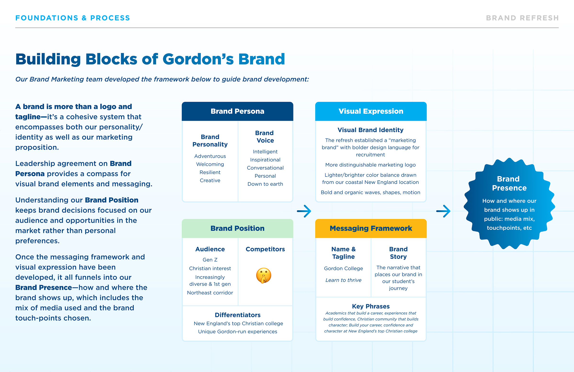
Our creative team developed the above framework to help leadership conceptualize the building blocks that make up a brand identity and to guide us in thinking through the strategic vision that would serve as the foundation for the visual brand and messaging system.
The Result
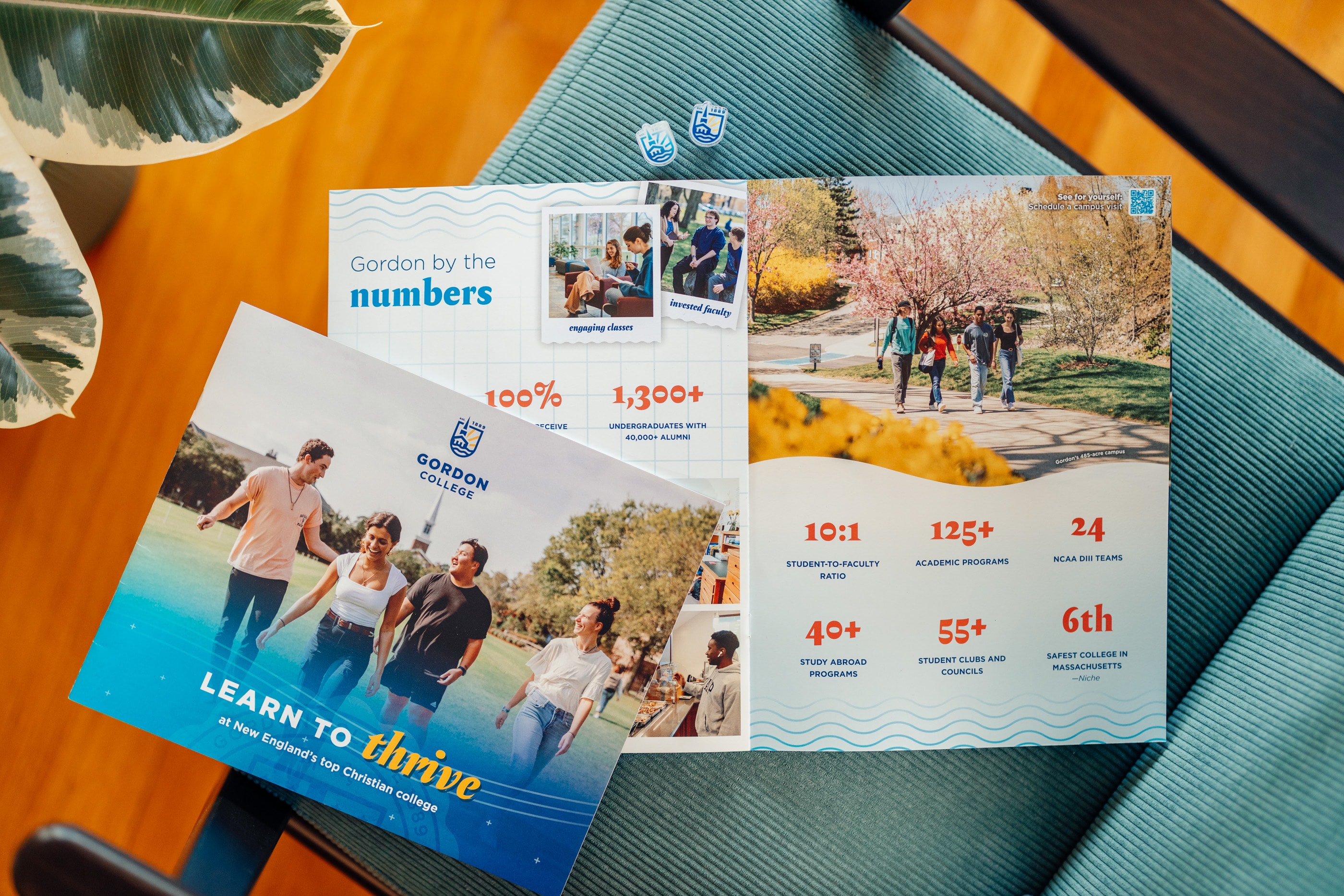
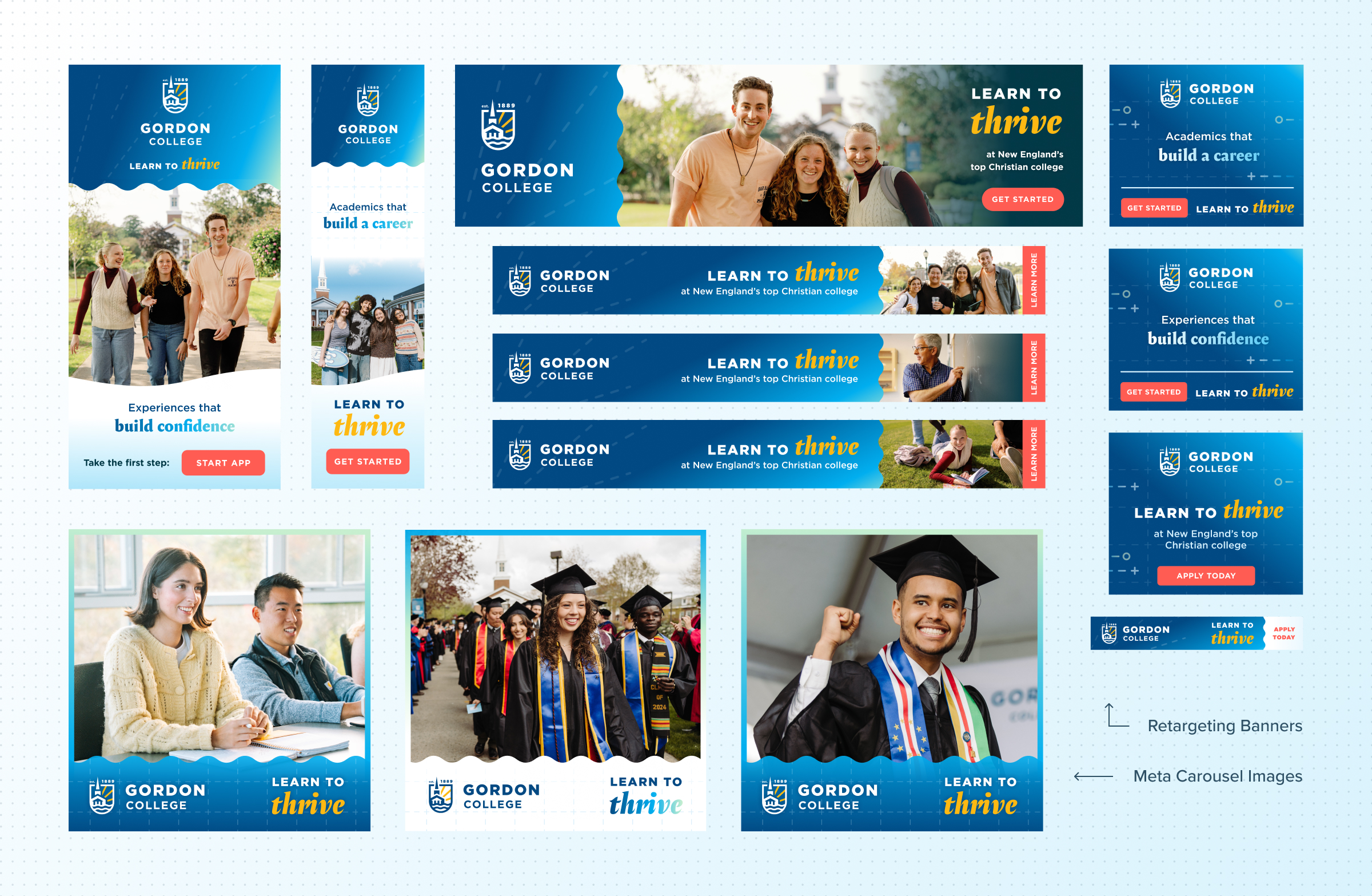
In the wild:
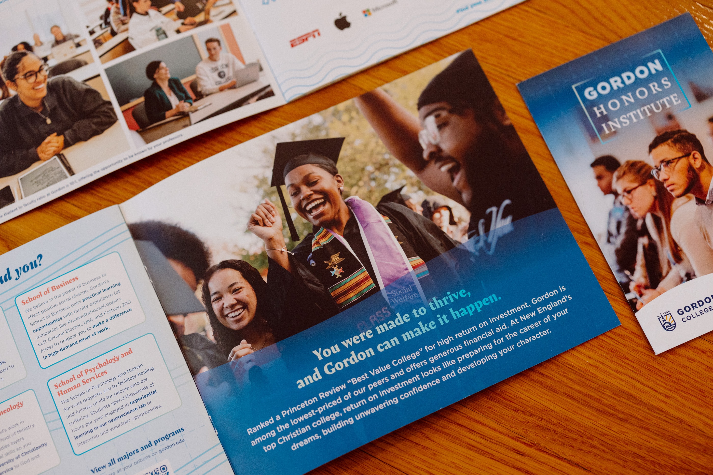
Once the brand launched, we used the refined messaging framework as a catalyst for coordinated marketing across all our channels: print, email, web, digital campaigns and physical manifestations across campus. The same customer-focused approach that we used to develop the brand itself also informed the strategy of how, when and where we communicated with our audience—leading to implementation of nurture and sales tracks within our commflow based around milestones in the customer lifecycle.

Video Campaigns
Working with the video production team at Lightmark Creative, I helped creative direct multiple digital video advertising campaigns that bring the brand promise to our audience via paid and organic social and OTT.
Step into your future at Gordon
This is Gordon
Expanding the system
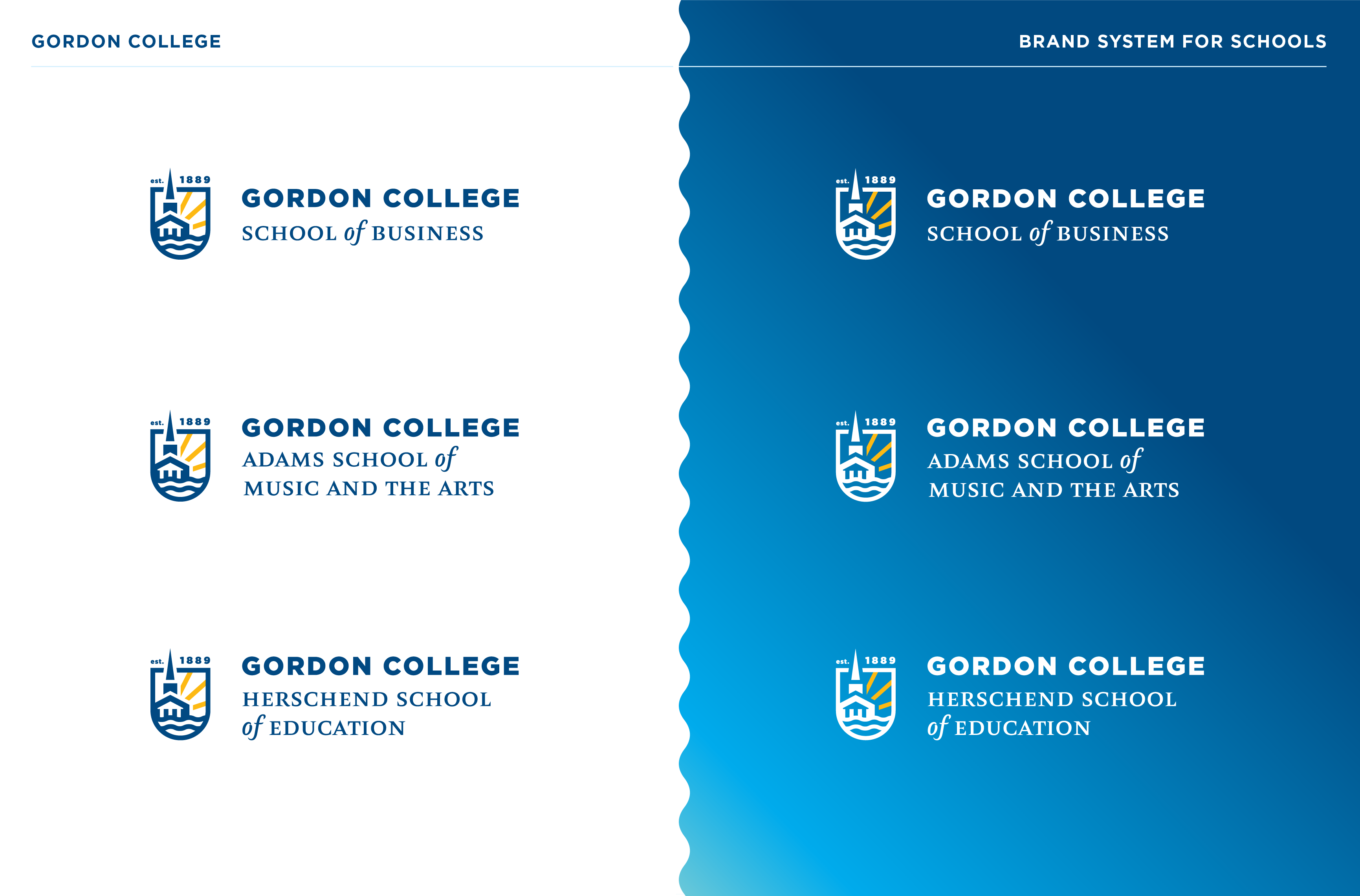
About a year after the brand launch, Gordon introduced a set of schools within the college. The newly defined brand provided a clear framework to expand into a family of School logos:
Up next: the website
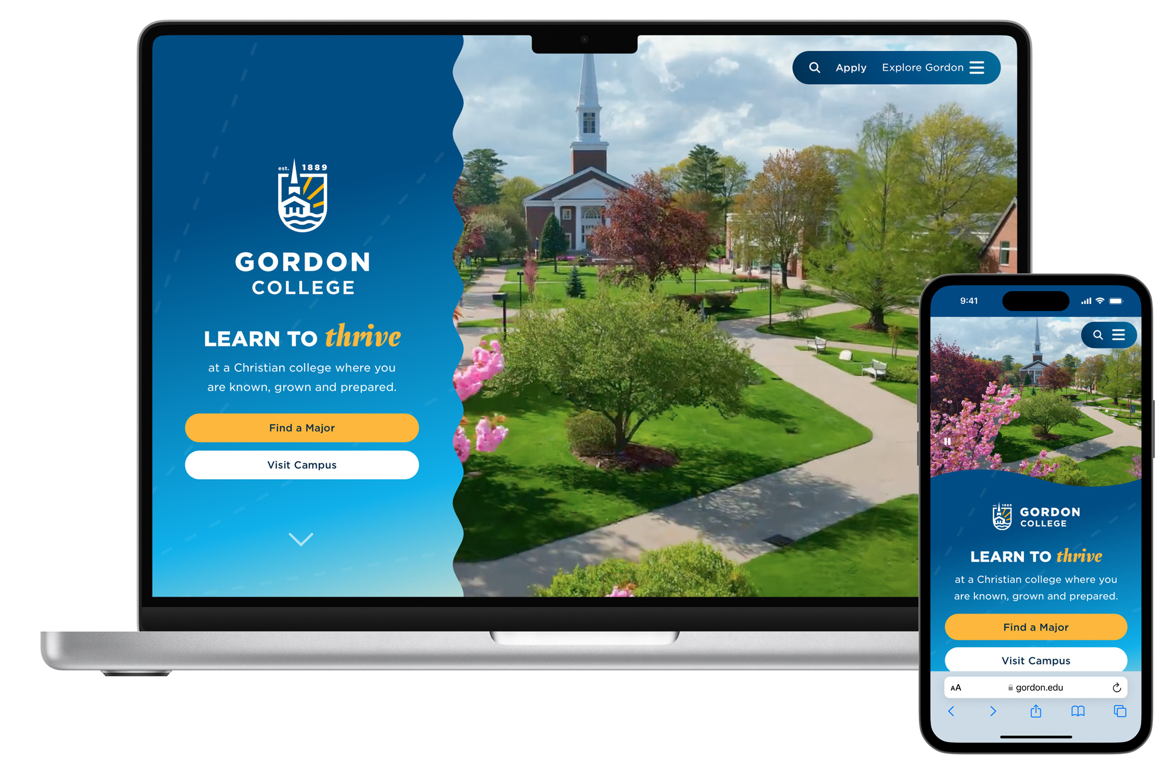
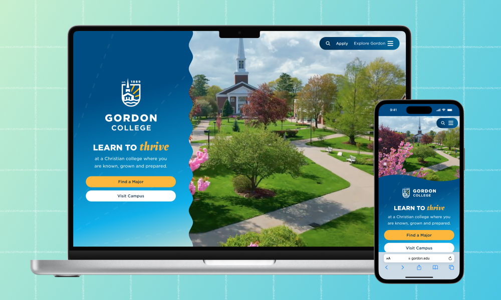
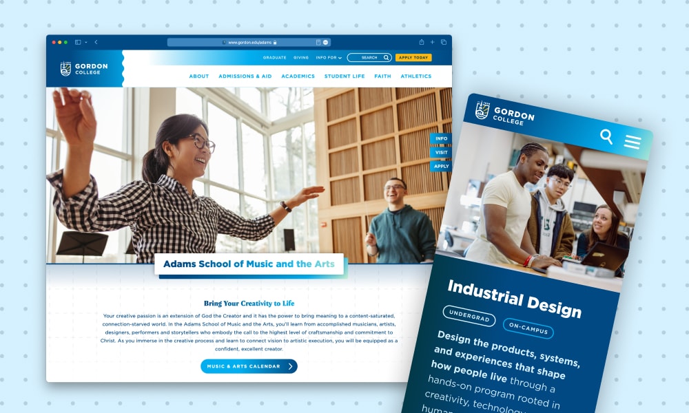
The brand refresh led into my next major project at Gordon, relaunching their website on a new platform to better express the brand and empower our marketing team with a more capable tool. View website project.
