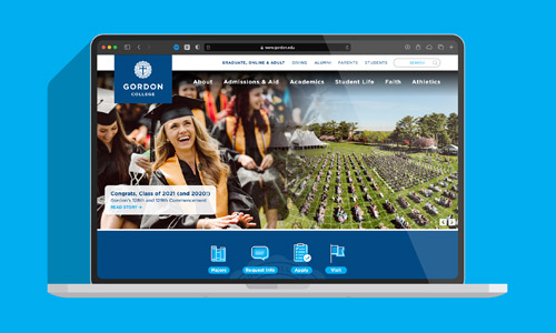
In my role as Creative Director and Web Team Leader at Gordon, I've taken the college's homepage through a number of iterations. As initiatives come and go, I strive to ground all updates in an understanding of the website's function for the college as well as the primary audience landing on it.
In Gordon's case, while many people use the website for various purposes, it's largest audience is prospective undergraduate students and it's most valuable function for the college is to lead those students to take some admissions action, such as filling out an interest form, contacting us, or starting an online application.
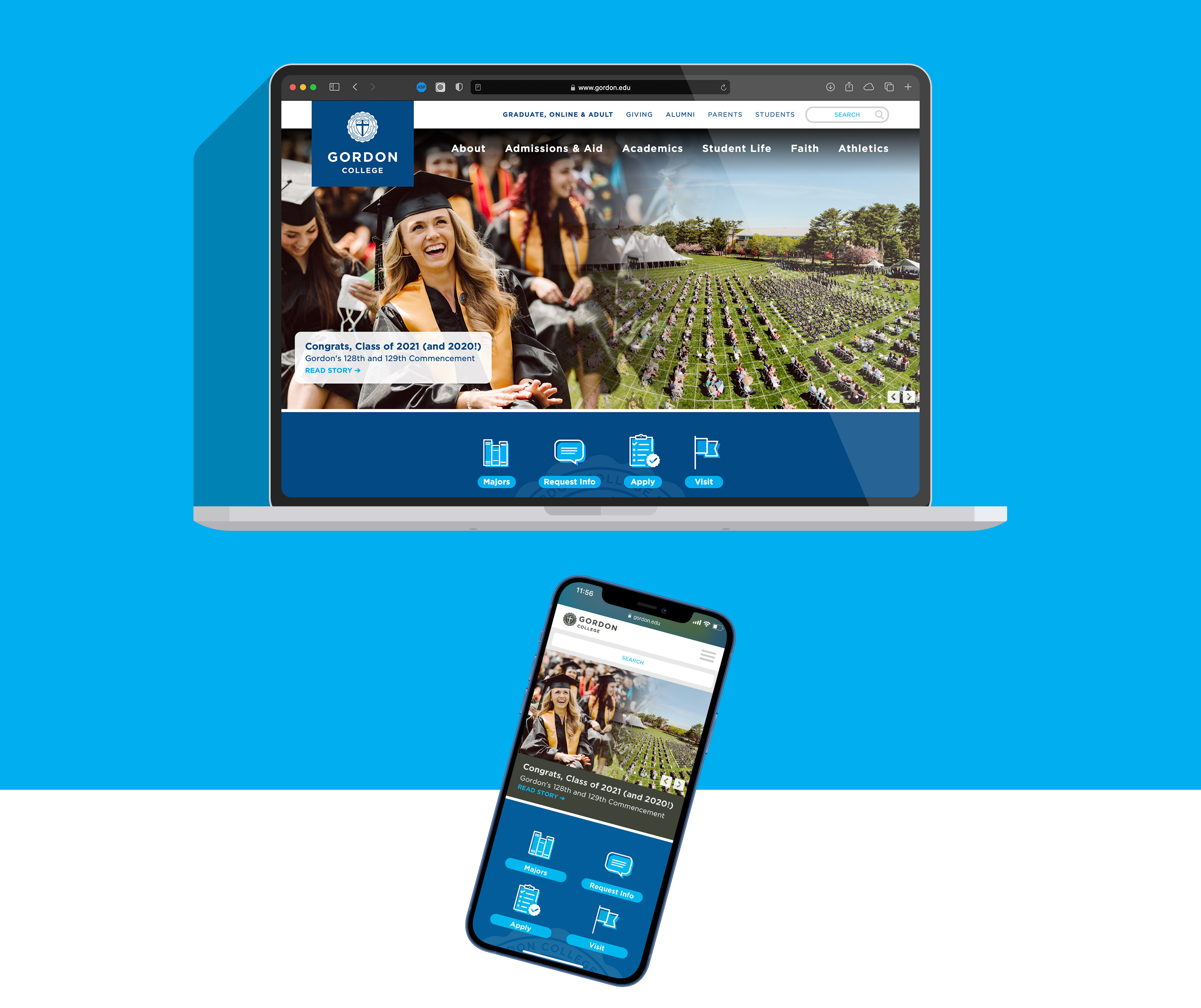
As the landing page for a large website, Gordon's homepage needs to be functionally clear and well-organized as well as narratively impactful and persuasive. It needs to reflect the passion and desires of our future students and connect that to value.
A guiding principle we use to make content decisions is that any item featured on the page should speak to the student experience in some way. In the case of the commencement story featured above, it obviously speaks to the current graduating class but also provides an example of the desired outcome and fulfillment of college.
Over time, this homepage has shifted it's focus away from college news and events to clear identity statements, examples of the student experience, and prominent admissions actions. Design and layout has continued to become increasingly spacious, open and friendly with larger type and fewer overtly gridded layouts. Academic programs feature prominently, as does information about affordability.